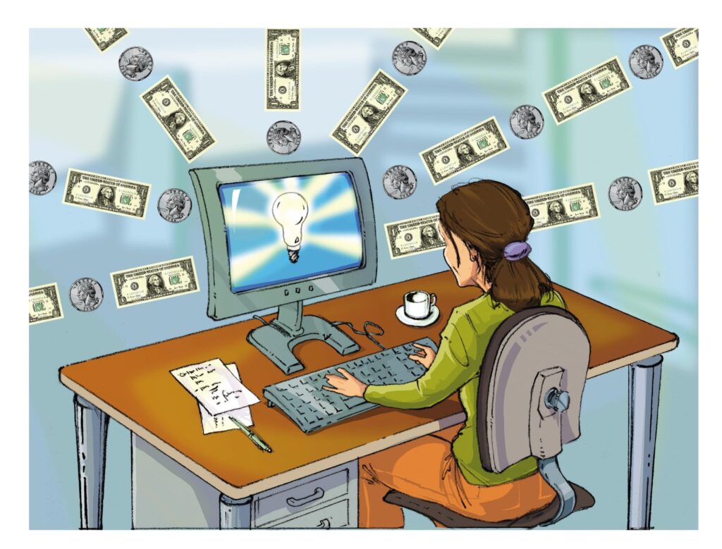
In internet forums and blogs people actively discuss the problem of website conversion rate evaluation and its increasing. The increasing part is one of the key tasks of web analytics, so this issue should be considered in more details.
So, what site conversion means? The simplest definition is the following: it is a process of making clients (customers) from site visitors. Conversion percent is correlation of number of visitors with the number of customers in percent. The problem is that many commercial site owners try to define optimal conversion rate for web resource which is not quite right. There can’t be one factor. For one business person optimal conversion rate is 3% (some online shop owners say that the conversion rate of their sites isn’t more than 2%), and for another – 10%. If the activity of site not only covers the expenses, but also allows to reinvest money and its future development – we can say that site conversion is not critically low.
But if the level of site conversion is threatening to site’s profit, you should take some actions to correct this situation. Taking into consideration that conversion is the process (visitor becomes customer), you must first make it maximally fast and convenient for visitors. The more difficult it is to use the site, the lower there is a probability of a new purchase. Bad website design makes people think that they have an affair with nonprofessionals.
Let’s discuss some key parameters that affect conversion rate of the web site:
Table of Contents
1. Don’t overload visitors with information.
Very often owners of online shops write too many information about product. In this situation it is better to make a link to additional information about the product and not to make visitor spend his precious time on reading the information that may be useless for him.
2. Don’t force visitors to give their personal information if it is not very important for you
For example, why must he register the account when he just wants to order a good? Or why do you ask his e-mail before he downloads price list orpdf-document? Very often visitors are asked to fill in a big web form, and if this process makes him tired and irritated, he will just leave your resource and never come back.
3. Be maximally frank and open for your potential client
s. For example, if for some moment your internet shop doesn’t have a certain product, don’t show it on the front page. It is better to mark it “This product is not available now”. If the customer pays for delivery, you shouldn’t hide this fact. It would be better to describe all process of delivery in details. It is also advisable to inform the client about the time of product or service delivery.
4. Embed a contact page in your online shop
It would be great if you build a customised web form that will fully suit your web resource. But if you are not very good in programming, then you may use one of online generators like PHPForms. Visitors will feel that you care about their opinion and that you can answer all their questions very quickly via email or by telephone.
5. Offer potential clients several variants of payment.
If you only accept the bank payment, your internet business won’t have any success. Very often the limited list of payments make people leave this website and go to your competitors.
6. Money refund.
Remember, it is one of the most verified ways of clients attraction. If the visitor knows for sure that he may take his money back, he will trust this online shop.
Of course, there are plenty of other advises about increasing site conversion, but it all depends on individual parameters of your site. Anyway, these advises are the ones that you should adhere first.


