Have you started building an email list yet?
If you have then you’ll no doubt have considered where on your blog your opt in form placement should be.
Since the beginning of time, or so it seems, there’s been an unwritten rule about where these should go.
Typically, the main places that people consider putting these have perhaps meant visitors have now become blind to them.
That’s not necessarily a reason to disregard those placements but more an opportunity to experiment with new ones.
Table of Contents
WHERE ARE YOUR TYPICAL OPT IN FORM PLACEMENTS?
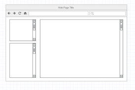
TOP OF RIGHT OR LEFT SIDEBAR

When I was first learning how to build an email list, the top of the sidebar was considered prime real estate to get email leads.
And in the main it still is because it meets some pretty good criteria.
- It’s above the fold;
- It can be seen on all posts and pages;
- It’s easy to set up with a widget.
However placing your form at the top of the sidebar may no longer be as successful as it once was.
Just as people are becoming blind to banner advertising, they are also becoming blind to opt in forms at the top of the sidebar.
AFTER THE POST

This is another popular place to entice email leads onto your email list.
After someone has read your post, they’re looking for what to do next.
Having a form after your post can only help build your email list though if people are reading to the end of the post!
Writing compelling content and strategically placing a striking opt in form at the end will certainly help your email list grow.
All life is an experiment. The more experiments you make the better. – Ralph Waldo Emerson Click To Tweet
LET’S START EXPERIMENTING…

If you’ve only got opt in forms at the top of your sidebar and after your post then you may be missing out on some email leads.
It’s time to start thinking outside the box and to find other placements which might convert well.
Depending on how enticing you make things, your email opt in rate is likely to increase the more places people can sign up.
Equally though you don’t want to overdo it and overwhelm your visitors with the chance to subscribe to your email list!
Here are some specific examples of the types of places you might think about adding an opt in form.
BOTTOM OF RIGHT OR LEFT SIDEBAR

You might think this is a daft idea since having an opt in form tucked away at the bottom of the sidebar might not generate much interest.
If you consider though that you could make the widget containing the form sticky then it may change your mind.
That way, as your readers scroll down the page, when they get to the form it will always be in view in the sidebar.
There are some plugins that will do this for you but many of them have been depreciated since WordPress 3.9 came along.
I do know, however, that you can do this without a plugin.
If you follow the instructions contained in the post – How To Make Any Widget Sticky – you’ll have a sticky widget working in no time at all.
POP UPS AND LIGHT BOXES

When the question of pop ups comes up, it can divide the room.
Some are completely against them, whilst others tolerate them and again still some don’t mind them at all.
The thing is though that they are a great way to get new email leads.
…And they also don’t have to be completely intrusive.
Many email marketing services allow you to set cookies which means that your pop up:
- can be restricted to only show once to each visitor, or;
- can be shown after so many days after its first appearance, and;
- in some cases once someone has subscribed they won’t see the pop up again.
I recommend using the plugin Hybrid Connect as this gives you much more control over when and how a pop up is displayed.
ABOUT PAGE

Considering the About Page is one of the most read pages on any blog, many people don’t use it to their advantage.
Get it right and it can be a great place to add an opt in form which will help you generate email leads in no time.
In fact, you might want to add two or three opt in forms on there when you check out your visitors statistics on Google Analytics.
Grab the chance to update your About Page now and add an opt in form or two whilst you’re at it.
CAN YOU THINK OF ANY MORE?
I’m sure you have tonnes of ideas of where the best place to put an opt in form on your blog is.
I’ve come up with a few but what I’d like you to do is share your thoughts and give examples if you can.
Let’s get the discussion started!
