I’m a writer and a blogger.
And there’s definitely a difference between the two.
What works in writing books doesn’t always work in writing a blog post and vice versa.
That’s particularly true of how you structure blog posts.
Get it wrong and it will make it harder for people to read.
Harder to read means people just won’t bother.
Learning how to write a good blog post doesn’t just stop with the words it’s also how you present and structure it.
Table of Contents
Headline And Subheadings

When it comes to reading blog posts, most people will scan them first.
That is, they don’t immediately dive into reading a blog post.
They scan over it.
They look at the headline and the introduction.
Then they look at the subheadings.
If there’s nothing of interest beyond the introduction then they move onto something else to read.
That’s why it’s important that you divide your blog posts into different sections.
Those sections need to each have a subheading.
Then it’s easy to scan.
Give people a huge chunk of words that aren’t broken up into sections and they’ll get bored.
is easier to scan through than
Bullet Points

Bullet points help to break things up and draw attention to themselves.
People are drawn to them because they offer small bite-sized pieces of information.
They often summarize things.
Be more imaginative than the standard bullet point and use a custom image.
That way it stands out more.
This article from Theme Hunter gives an in-depth overview on using custom bullet points:
Images

Blog posts without images look strange.
They seem fundamental to how we structure blog posts nowadays.
You might like them without images but they don’t stand out.
They also don’t do so well in social sharing from my experience.
Do you share other people’s blog posts on Facebook, Google+ or LinkedIn if there’s no image?
I’m sure the answer is more than likely no.
Would you bother to make your own image up just so you can share someone else’s post on those and the likes of Pinterest and Flickr?
Again, I’d think the answer is no.
There are so many free tools now that adding an image and making it your own is eezypeezy:
- Compfight
- Photo Pin
- Open Clip Art
- Pixabay
- Canva
- PicMonkey
- Compressor.io
Short Paragraphs And Sentences
From my experience, it’s not a good idea to write big chunks of text.
Short paragraphs and sentences make your blog posts much easier to read.
That’s maybe not what you’d do when you write a book.
When people are reading online though, it can be tricky to concentrate when there’s a sea of words.
It’s also important not to use complex sentence structures.
Keep things simple and your readers will love you for it!
White Space

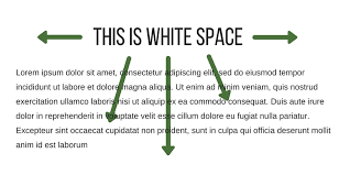
Having shorter paragraphs and sentences will go some way to leaving white space in your blog posts.
That’s important for ease of reading and how you structure blog posts overall.
Making your blog too busy can make it inaccessible.
White space allows readers to focus on each sentence and paragraph and not get lost on the page.
Calls To Action

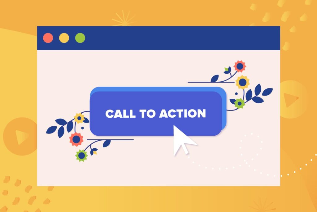
It’s always important to have a call to action at the end of your post.
Potentially also one in the middle too.
If you don’t have one then you’ve wasted an opportunity to guide your readers to do what you want them to do next.
Adding a call to action will encourage you visitors to follow your direction.
People are more likely to do things for you if you ask them.
That might be to share your post on social media or you might suggest they have a look at one of your products or services.
You could also direct them to buy something through your affiliate link.
Sometimes I also use a call to action in the middle of the post such as a quote for people to Tweet.
Highlight Important Sections

As a way to draw attention and to break things up a little, it’s a good idea to highlight important sections of your post.
What I mean by that is to add a text box with a different background color or something similar.
Depending on which blogging platform you’re using, your theme may already include shortcodes that allow you to do that.
You can use CSS instead though.
Here’s some example code you can use to create a text box (see section Text with a background):
What I’m Using
Hemingway
I now write all my blog posts in the Hemingway app.
It helps me with readability.
It alerts me to sentences that are hard to read amongst other things.
It’s often longer sentences and paragraphs that it points out allowing me to restructure things.
Are there any tools you use to help you structure your blog posts?
