27 January 2022
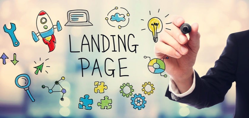
Must Know Mistakes That Destroy The Image Of Your Landing Page
Landing page is the face of your website that promotes customers to take a desirable action. Whether it’s all about purchasing through a site, registering for a magazine or downloading an eBook, landing pages play an important role in conversions.
There are a number of factors by which your page will surely get affected. Also, these factors are responsible for decreasing conversions. Here we will discuss some of the common mistakes while designing landing pages, have a look at the following:

- First and foremost, pop-ups are highly annoying for the visitors. Most of the times, they just close them quickly without reading the given information. So, it’s better to avoid using pop-ups in your landing page because it may give a cheesy and spammy look to the visitors.
- Another biggest mistake is using ineffective headlines. A poor headline will not only discourage them to continue reading but also, it will kill the curiosity of your offer. If you lose them, then you may lose your business forever.
- Multiple offers on just one page create confusions among visitors. It shows as if you are competing with your own products. Keep a clear objective of your business and settle a single conversion goal for proper functioning.
- Content is the soul of your webpage. Poor and irrelevant content conveys a non- professional image of your business. Obviously, when people find nothing of their interest, they start searching for other options.
- Your landing page can’t ignore the basic aesthetics. Pages with inappropriate fonts, colors, clip art and highlighted copy restrict the visitors to take any further action. All these factors contribute a lot in damaging your business image, so pay attention on such things.
- Inappropriate format is another mistake which should be avoided in any case. If you clutter too much textual information in long paragraphs, then it must be boring for the visitors to read with interest. Text without bullets and sub-headings looks less interesting and less valuable; hence, fix these problems as soon as possible.
- Too much call to action buttons are the sources of confusions. They affect the usability of your landing page as most of the visitors remain confuse to choose the most beneficial option.
- Bad stock of images is the most damaging thing for your landing page. Sometimes the images are visually appealing but they don’t have any relevance with the page. Stop decreasing the quality of your page because it won’t help you to improve conversion rate.
So, the above are some great mistakes that should be avoided while designing your landing page. Rectify your mistakes immediately in order to practice smooth business functioning.
Please follow and like us: